The impact of colors on the optimization of minimalist spaces: how to choose the right palette to enlarge environments
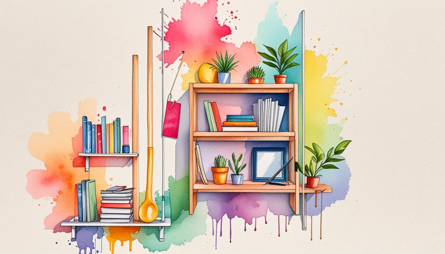
Understanding the Impact of Color in Minimalist Design
In the realm of interior design, colors play a pivotal role in shaping our perception of space. Particularly in minimalist environments, the right color palette can enhance the feeling of openness and serenity. Understanding how to effectively leverage color can transform a cramped area into a spacious oasis. By delving into the subtleties of color choice, one can create spaces that are not only visually appealing but also emotionally uplifting.
When selecting colors for minimalist spaces, several impactful aspects come into play:
- Light Colors: Whites, light grays, and soft pastels reflect more light, creating an illusion of spaciousness. For instance, a soft beige on walls can make an 800-square-foot apartment feel more expansive. Natural light plays a critical role in this aspect, so pairing light colors with large windows can enhance brightness and amplify the sense of space.
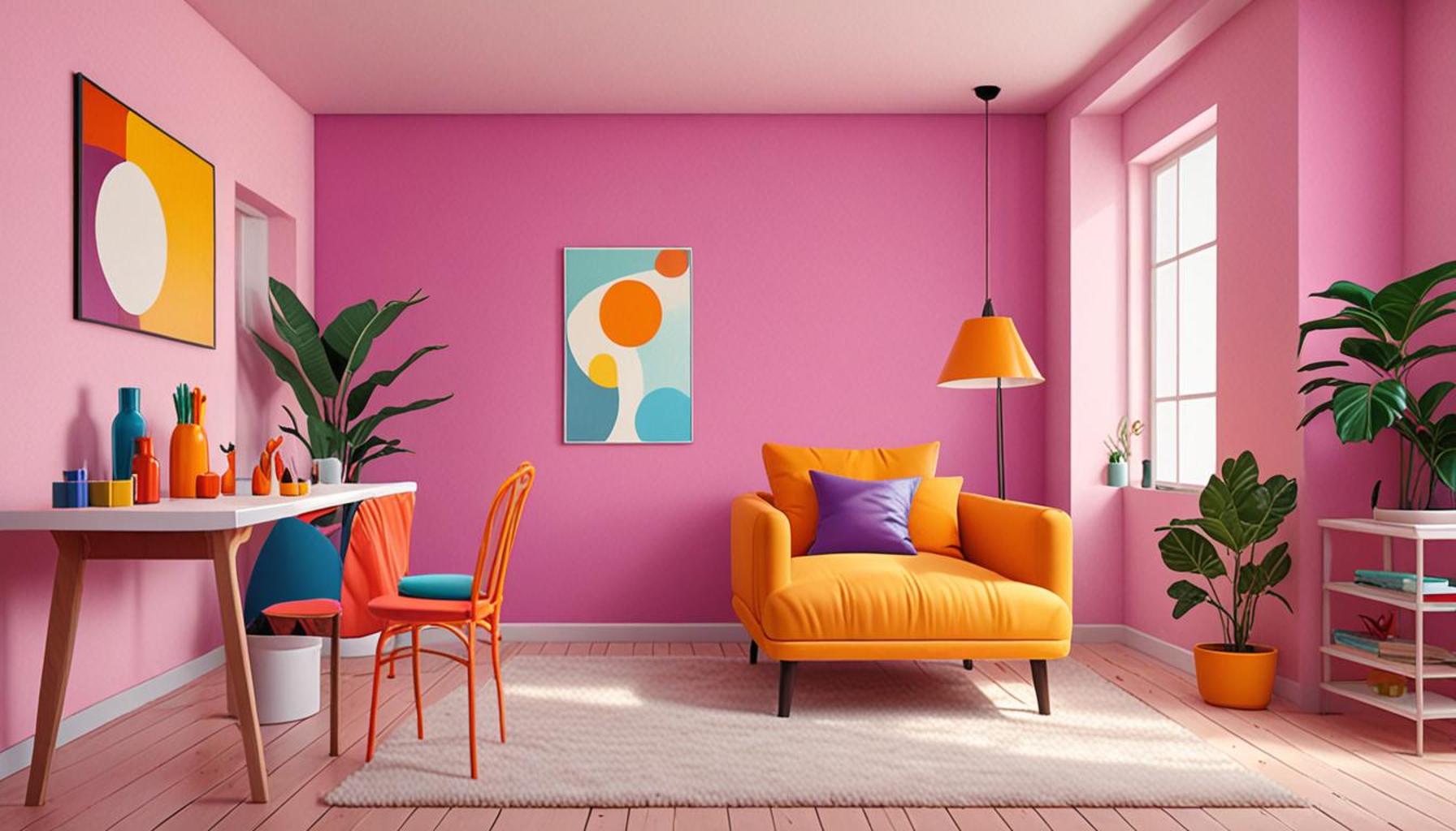
- Accent Shades: Bold hues can act as focal points, drawing the eye and breaking the monotony of a minimalist design. A single piece of furniture, such as a red chair or a bright blue vase, against a pale backdrop can inject personality into the room without overwhelming it, highlighting the minimalist ethos of ‘less is more’.
- Color Temperature: Warm colors can create a cozy atmosphere, while cool colors can make spaces feel more expansive. For example, a room with soft yellows and light oranges evokes a welcome warm embrace, while soothing blues and greens can emulate the tranquility of open skies or lush landscapes, making the room feel larger and more inviting.
Moreover, research into color psychology underscores that the colors we surround ourselves with can significantly influence our mood and functionality. Calming shades of blue and green are associated with tranquility and relaxation, making them ideal for a minimalist bedroom or office space. In contrast, vibrant yellows are known to stimulate intellect and creativity, lending themselves well to minimalist workspaces or creative studios.
Choosing the right palette is essential for maximizing spatial perception and achieving a seamless design flow. A cohesive color scheme fosters harmony in a minimalist setting, allowing clean lines and functional furnishings to shine through without competition from clashing colors. By integrating colors that harmonize with each other, one can achieve an understated elegance that celebrates simplicity.
Delving deeper into the science of color in design can provide valuable insights into optimizing your living spaces. Numerous resources exist for homeowners, from color consultant websites to books on the principles of color theory. With the right choices, it’s possible to redefine how we experience our environments, enhancing the pleasure and functionality of our daily lives.
DIVE DEEPER: Click here to enhance your wardrobe
Choosing Colors That Maximize Space and Light
In minimalist design, where the mantra is often “less is more,” color becomes an essential tool in creating the illusion of space. Selecting the right palette not only enhances aesthetic appeal but also serves a functional purpose in making areas feel larger and more inviting. Understanding the implications of different colors can profoundly impact how we experience our living and working environments.
One fundamental concept to grasp is the relationship between color tones and spatial perception. Lighter colors are widely recognized for their ability to reflect light, which creates a heightened sense of airiness. When considering a color scheme for a minimalist space, light shades of white, ivory, or soft pastels should be prioritized. For instance:
- Walls: Opting for a delicate shade, such as powder blue or creamy beige, allows walls to recede visually, effectively expanding the perceived boundaries of a room.
- Ceilings: Painting ceilings in slightly lighter hues than the walls can enhance vertical space, making rooms feel taller and more open.
- Floors: Light-colored hardwood or light-colored carpets also contribute by creating continuity throughout the space, eliminating visual interruptions that can confine a feeling of openness.
Additionally, the strategic use of color temperature plays a pivotal role. Cool colors such as blues and greens have a receding effect and can make a space feel more expansive. In contrast, warm colors like yellows and oranges can create an inviting atmosphere, lending a sense of warmth and coziness. It’s a delicate balance that can be leveraged to suit the purpose of each room:
- Living Areas: Soft greens and blues can promote relaxation while providing a spacious feel.
- Workspaces: Warmer neutrals complemented by energizing accent colors could inspire creativity while still maintaining an organized, minimalist aesthetic.
The concept of contrast also plays a vital role within minimalist spaces. By introducing singular blocks of color against a predominantly neutral background, one can create a captivating focal point without overwhelming the senses. A brilliant piece of art or a striking furniture item can serve to punctuate a minimalist design while fostering a rich dialogue with the surrounding colors.
Moreover, understanding color psychology can unveil insights into optimizing moods and behaviors within minimalist spaces. Pastel palettes are associated with tranquility, making them ideal for calming environments like bedrooms and meditation areas. Conversely, energetic colors find their place in dynamically designed spaces like kitchens or home offices where productivity and creativity are vital.
As you ponder over color choices, it’s essential to consider not only how they will look in isolation but how they will interact with light at different times of day and under various weather conditions. This aspect can significantly alter the perception of space and the emotional ambience of a room. With thoughtful selections, you can achieve minimalist spaces that appear larger while embodying elegance and simplicity.
The Impact of Colors on Minimalist Spaces
When it comes to creating minimalist spaces, the colors you choose can dramatically affect both perception and functionality. Selecting the right palette not only enhances aesthetics but also allows you to manipulate the sense of space. In this section, we delve deeper into how color influences minimalist designs and offer insights on choosing the ideal hues to optimize your environment.
The Psychological Effect of Colors
Colors evoke emotions and influence human behavior. For instance, lighter shades such as whites, light grays, and pastels often create a sense of openness and serenity. These colors reflect light, making rooms feel larger and more inviting. In contrast, dark colors can create a cozy atmosphere but may also make spaces feel cramped if overused. Hence, incorporating accents with dark tones on walls, furniture, or accessories can add depth without overwhelming the room.
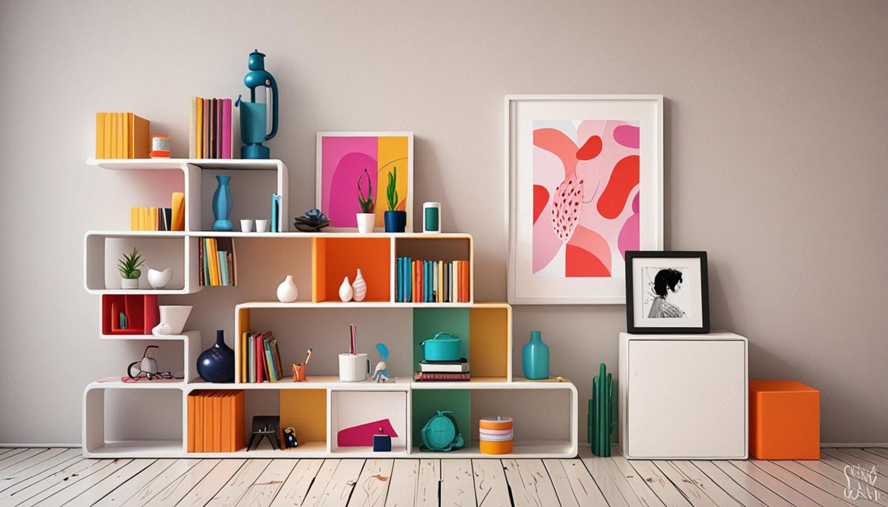
Choosing the Right Palette
To enlarge environments visually, consider a monochromatic palette. This strategy uses various shades of a single color, helping to create harmony while preventing stark contrasts that can visually break the space. Pairing this with a few well-placed textures or materials—like soft textiles or wood elements—can further enhance the space’s dynamism without clutter.
Case Studies: Successful Applications
Many successful interior designs utilize color strategically. For example, a studio apartment painted in soft blues and whites appears airy and spacious, with natural light being a key element. Alternatively, offices employing muted greens can improve focus while promoting calmness. Such examples underscore the importance of experimentation when choosing a palette.
Testing Color Combinations
Utilizing paint samples or virtual reality tools can assist homeowners in visualizing different color combinations. This approach allows experimentation with how various tones interact, ensuring the chosen colors align with individual preferences while optimizing the minimalist ethos.
As you consider your palette, remember that the right colors can have a profound impact on both the functionality and aesthetic appeal of your minimalist spaces. Dive deeper into this essential aspect of design to truly transform your environments.
| Category 1 | Category 2 |
|---|---|
| Color Psychology | Impact of colors on mood and perception in minimalist settings. |
| Monochromatic Schemes | Using varying shades of one color to enhance space perception. |
DIVE DEEPER: Click here to discover more about creativity and intentional living</a
Integrating Patterns and Textures for Depth
While colors undoubtedly play a starring role in the optimization of minimalist spaces, the incorporation of patterns and textures cannot be overlooked. In a world where simplicity reigns, carefully chosen patterns can add depth and interest without cluttering the visual landscape. The key lies in selecting subtle designs that harmonize with the color palette and enhance the sense of space rather than detracting from it.
For instance, a soft geometric pattern on a throw pillow, in a color that matches the wall, can create visual intrigue while maintaining a cohesive look. Textures from materials like linen, wool, or cotton can provide a tactile quality that invites engagement, which can be especially beneficial in minimalist environments where there are fewer distractions. Using a layered approach to textures can elevate the design without compromising on spaciousness:
- Soft furnishings: Choosing fabrics that catch the light, such as light jacquard or sheer curtains, adds depth without overwhelming the senses.
- Wall art: Opt for pieces that utilize texture without being visually heavy, such as a woven wall hanging or a canvas with a subtle textural finish that complements the overall design.
Another powerful technique involves the art of transitions. Shifting hues gently from one area to another can create a seamless flow that visually elongates the space. For example, gradually lightening shades from the living room to the adjoining hallway can make the rooms feel more interconnected, which can bolster the perception of expansive environments. This is particularly relevant in open plan designs where space can easily feel segmented without proper visualization.
Leveraging Accent Colors Wisely
Accent colors offer another dimension to the color palette, injecting life and personality without overwhelming the minimalist aesthetic. When deployed correctly, they can invigorate a space while drawing attention to key features. In minimalist design, it’s wise to limit accent colors to just one or two, ensuring these hues pop against a softer backdrop:
- Furniture: A single deep blue chair in a sea of neutrals becomes a commanding focal point, lending character to the room without exerting a sense of clutter.
- Accessories: Elements such as cushions, vases, or artwork can be selected in bright colors to add vibrancy without overwhelming the minimalist ethos.
Harnessing Natural Light
A crucial factor in the perception of space is natural light. When choosing colors for a minimalist environment, the amount of daylight a room receives can significantly influence the effectiveness of your palette. Color can react to changes in lighting throughout the day, shifting in tone and character. Rooms bathed in sunlight will likely amplify warmer hues, while cooler tones may pull back into a more subdued palette in shadowed areas. This phenomenon underscores the importance of testing colors using swatches at different times of the day.
In addition, maximizing daylight can be achieved through smart design choices such as using mirrors to reflect light and enhance brightness. This technique doubles as a way to imbue depth into the space, as mirrors not only reflect color but also create an illusion of additional area.
Therefore, as you contemplate the right colors for your minimalist spaces, consider how these hues work in concert with patterns, textures, and light. With a careful approach, spaces can effortlessly combine the essence of design simplicity with an expansive ambiance, elevating any room from ordinary to extraordinary.
DIVE DEEPER: Click here to discover more
Conclusion: Elevating Minimalist Spaces with Color
In a world where minimalist design continues to dominate, understanding the impact of colors on spatial optimization is essential for creating environments that feel both expansive and inviting. The right color palette not only defines the aesthetic but also shapes the perception of space, allowing it to breathe and flow. By choosing lighter shades and harmonizing hues, one can instantly enlarge the feel of any room, turning tight quarters into open havens.
The deliberate integration of patterns and textures, alongside a well-thought-out color scheme, can dramatically enhance visual depth, ensuring that minimalist spaces remain engaging without overwhelming the senses. Accent colors, when applied strategically, breathe life and character into these serene environments, providing focal points that enrich the overall experience. Moreover, the role of natural light cannot be underestimated; it magnifies the effect of colors, transforming how they are perceived throughout the day.
As you embark on your journey to optimize minimalist spaces, consider these elements as interconnected rather than isolated choices. By navigating the intricate balance between colors, textures, and light, you can forge rooms that invite tranquility while offering a sense of spaciousness. Ultimately, the exploration of color for minimalist environments is not merely about aesthetics; it’s an invitation to experience the power of design to transform and elevate everyday living. Stay curious, experiment, and let your unique vision for space unfold.